McDonalds Billboards Turn Motion Into Munchies
Mickey D’s is back at it again with another delicious twist on a typical advertisement. In some countries, McDonalds has placed stores called “McDrives”. These small 24/7 stores offer no seating or counter service, and are usually placed right off of a major road or highway.
As a person who frequents the drive-thru, I can attest that this may not be the greatest idea in the world. Depending on the capabilities of the store, the line may be ridiculously long at all times. I don’t really want to wait twice as long for a burger just so I don’t have to get out of my car. But, impatience aside, McDonald’s newest campaign really shines the light on these new McDrives.
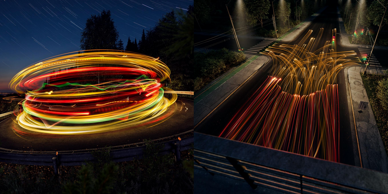
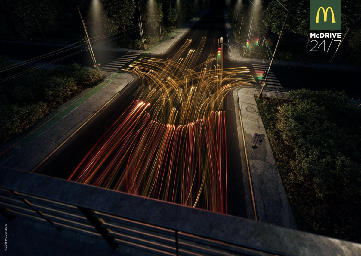
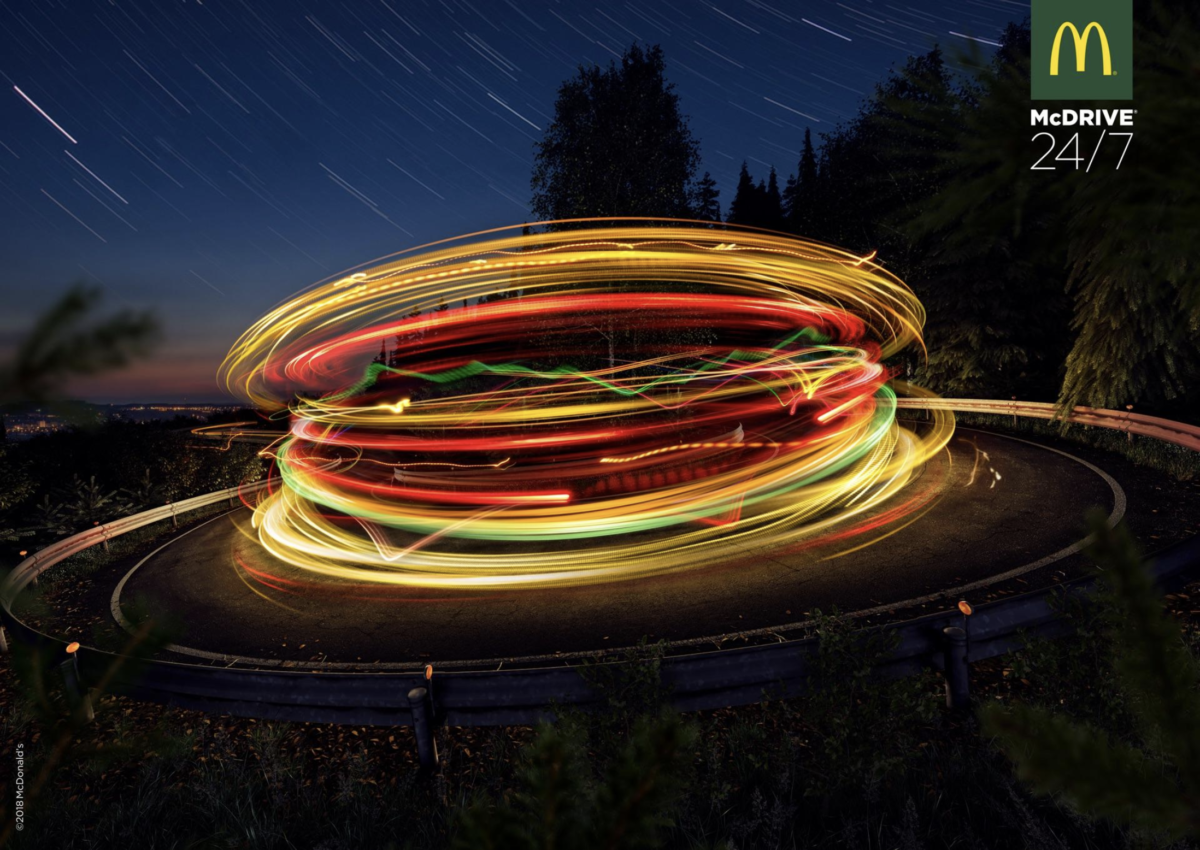
On April 24, two billboard advertisements were created by creative agency DDB. The billboards were simple, only an image and a very short snippet of text, which made them very effective. The audience would know exactly what they were looking at once they glanced at the ad and their attention would not be taken off of the road for longer than a few seconds. Both advertisements were created using different types of vehicles, long-exposure camera lenses, and some crazy editing skills.
One ad uses a curved road to create an image of the tasty cheese burger we all know and love. The second ad uses an intersection to create a picture of those signature golden french fries. Personally, I think these are some of the most creative advertisements I’ve seen in a while. They portray through imagery both the food itself and “fast” McDrive experience. When I saw these ads online, it really peaked my interest in figuring out exactly what McDrive was. That in a nutshell is what effective advertising does.
*Images via screenshots from the Ads of the World website
- SOURCE: Ads of the World
- BRANDS: McDonalds
- WHY YOU WILL LOVE IT: Because when you’re hungry everything looks like McDonalds

AUTHOR: Sara Woika
ORIGIN: Speaking Human Contributor
Follow Sara on Speaking Human / Human Content from Sara

