Why Johnson’s ‘So Much More’ Is The Commercial of the Year
Every once in a while a commercial comes along that just grabs your eyeballs and sucks them to the screen so you can’t look away (and you don’t want to). “So Much More” from Johnson’s Baby is that commercial. It pulls us in every time it comes on and puts us under a spell.
That’s why it’s our pick for best commercial of the year. Maybe of the last five years.
Brief Background on This Commercial and Johnson’s Marketing
This commercial aims to show a bath is “so much more” and can help stimulate a baby’s senses. It’s part of a global marketing campaign from Johnson’s that focuses on the impact of parents’ daily rituals with their newborns—particularly during bath and bedtime—on early child development.
If you haven’t seen this commercial yet, watch it below. Then read on to find out what we love about it…
6 Things We Love About Johnson’s ‘So Much More’ Commercial
We recently discussed some of the smart design and content aspects of this commercial on our video podcast Visually & Verbally. Here are six things we mentioned that are significant, strategic and spectacular about “So Much More”…
1. It’s Mesmerizing
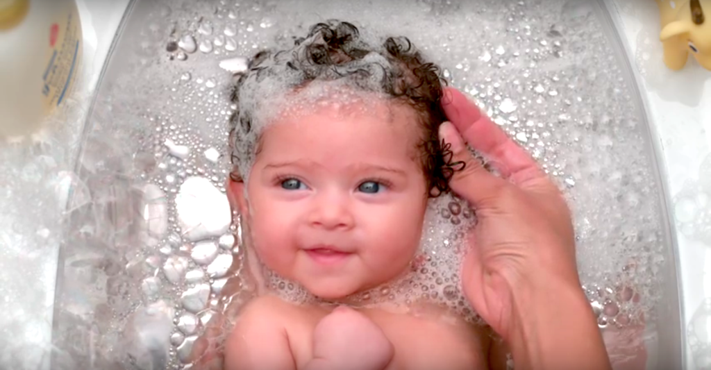
The single, sustained shot that makes up the majority the video is jarring. That’s partially because we’re so used to seeing quick cuts these days. But it’s also because of the fantastic framing—with that beautiful baby surrounded by all those bright bubbles. It’s an impact image played in slow motion so that it becomes almost hypnotic.
2. It Expertly Uses Point of View
This video and its associated marketing effort are aimed at parents. Wisely, this video is filmed from a parent’s perspective. And so it becomes you, the viewer, who is looking down at that baby, conjuring memories of your own child. It doesn’t just speak to parents—it immerses you in the experience from the get-go.
3. The Serene Tone Is Pitch Perfect
From the voiceover to the heavenly depiction of bathing a child, the commercial sets a warm, calm tone and sustains it throughout. It perfectly matches the “experience” message Johnson’s is relaying here. And while it may not really match the reality of most child bath times, it creates a mood that relaxes the shoulders and hits the parental heart.
4. Focus on “Experience” Is a Master Stroke
Laid out through a soft, calming narrative that plays like a parent’s interior monologue, the message of this ad wisely focuses on the benefit of enhancing the bath-time experience rather than just saying why the bubble bath is great. There’s some strong, strategic verbs in this narration: stimulating, nurturing, helping. All things a parent naturally wants to do.
5. Brand Integration Is Seamless
Matching the calming tone is the seamless integration of the brand and product at the end. This is not a hammer over the head nor is it completely unrelated to the images that came before (a recurring problem in many commercials today). Instead it fades in over white at the end, right at the baby’s eyeline, grabbing our attention and appearing completely natural.
6. The Baby Is the Year’s Best Actor
We don’t know how many babies they auditioned or how many takes it took to get the perfect bath, but whatever they did it worked. This kid crushes it, delivering the perfect glances, smiles and grabs at exactly the right moments. This is your dream baby. Without the right face at center, this commercial wouldn’t have worked. But this baby owns the screen.
Creating the Perfect Bath of Branding and Marketing Impact
Breathtaking visuals. A strong, impactful message. And a style and tone that directly speak to the target demographic. All of that adds up to an awesome and exceptional commercial. From our MONSTER point of view, Johnson’s “So Much More” stands with the top commercials of the year.


