The New DCU Logo Harkens Back to the Classics
Nostalgia has a unique charm, capable of bringing joy by revisiting cherished memories. Whether it’s the revival of classic video games or the creation of movie sequels decades after the original, tapping into the past can resonate deeply with audiences. However, there’s a fine line—too much nostalgia can dilute its impact. This delicate balance might play a crucial role in the success of James Gunn’s new DC Universe (DCU).
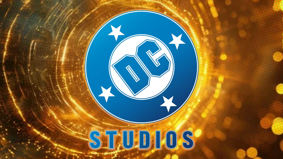
The DCU emerges after the divisive run of the DC Extended Universe (DCEU), Warner Bros.’ initial attempt to create a cinematic universe featuring their iconic superheroes. The DCEU often introduced unique, sometimes controversial, interpretations of beloved characters, which didn’t always sit well with fans. To address this, the studio has made a promise to remain faithful to the source material—a promise symbolized by the unveiling of their new logo, which pays homage to the past.
The “new” DC Studios logo is actually a direct recreation of the DC Comics logo used from 1976 to 2005, a period when the publisher was at its peak, delivering some of its most iconic storylines like “Crisis on Infinite Earths” and “Batman: The Long Halloween.” By reviving this logo, the studio signals its intent to draw inspiration from an era when DC Comics reigned supreme. Now, the challenge for the DCU is to live up to this promise and elevate its heroes to new heights.
- SOURCE: Variety
- BRAND: DC

AUTHOR: Zach Dunphy
ORIGIN: Speaking Human Contributor
Follow Zach on Speaking Human / Human Content from Zach

