Tough Typeface Questions About Spielberg’s ‘The Post’
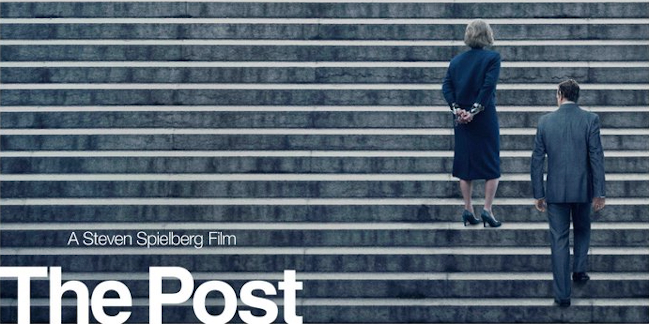
Steven Spielberg’s new movie The Post is a true story about The Washington Post in the 1970s. Yet, strangely enough, the movie’s marketing does not use the newspaper’s instantly recognizable font as one would expect.
The real-life logo for The Washington Post looks like this:

As you can see from the image of The Post movie poster above, the font used in the marketing does not match real life. Instead it uses Helvetica, a popular font used by a lot of brands—but one that definitely differs from the historical and stately Washington Post font. Why make that choice?
In a Ringer article Jay Shaw, senior creative director at Mondo, says, “If I had to guess, the font was chosen to strip away decoration in favor of clear communication.“
- SOURCE: The Ringer
- Brand: The Post
- WHY YOU WILL LOVE IT: Sometimes an unexpected typeface actually delivers some deeper meaning


