Why Facebook’s new logo might seem less appealing
In 2004, Mark Zuckerberg launched The Facebook (eventually simplified to Facebook) exclusively to Harvard students. It was the beginning of a social media era that caused humans to be connected with each other unlike any other time in history.
To say that Mark and his early iterations of The Facebook were less about design and more about functionality is an understatement. He was a programmer at heart and Facebook was the platform that allowed him to accomplish the goals of socially connecting college students.
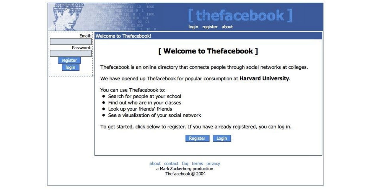
But as Facebook matured, so did the identity of the platform and the brand started to take the shape of what we have known for over a decade.
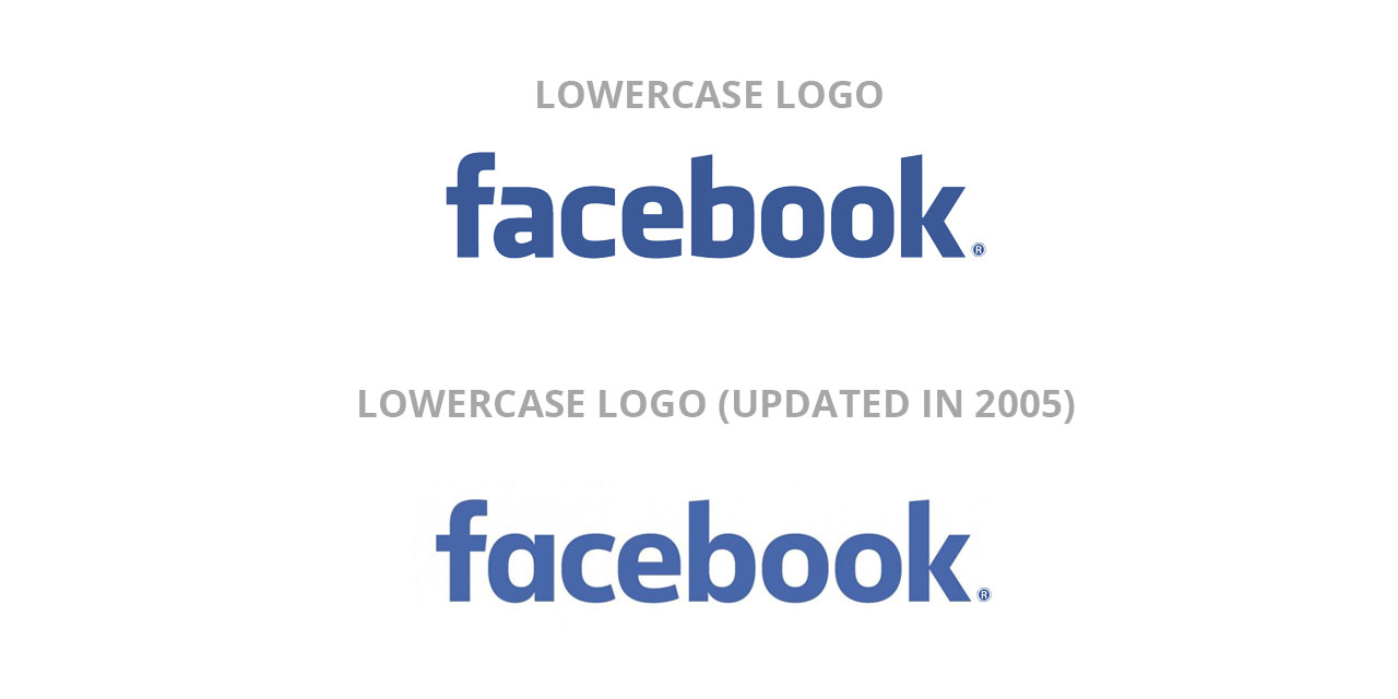
Then at the end of 2019, Facebook introduced its new company branding, which was “designed for clarity” and meant to create a visual distinction for users between the company and the app that they use every day. As with all things that belong to the internet, opinions on the identity change flooded every corner of the digital universe. In fact, Visual Objects—a portfolio website that showcases work from top creative firms around the world—surveyed 1,001 people in the United States about the logo update and 80% of them said they liked the original logo better.
According to Facebook, they “needed the wordmark to establish distinction from the Facebook app and allow for a clearer connection to the full family of technologies” — namely Messenger, Instagram, WhatsApp and Oculus. Since Facebook is more than just one platform today, it’s important that the umbrella identity signals a clear unification between all their social media channels. The new logo accomplishes this task by changing colors depending on the platform it’s representing.
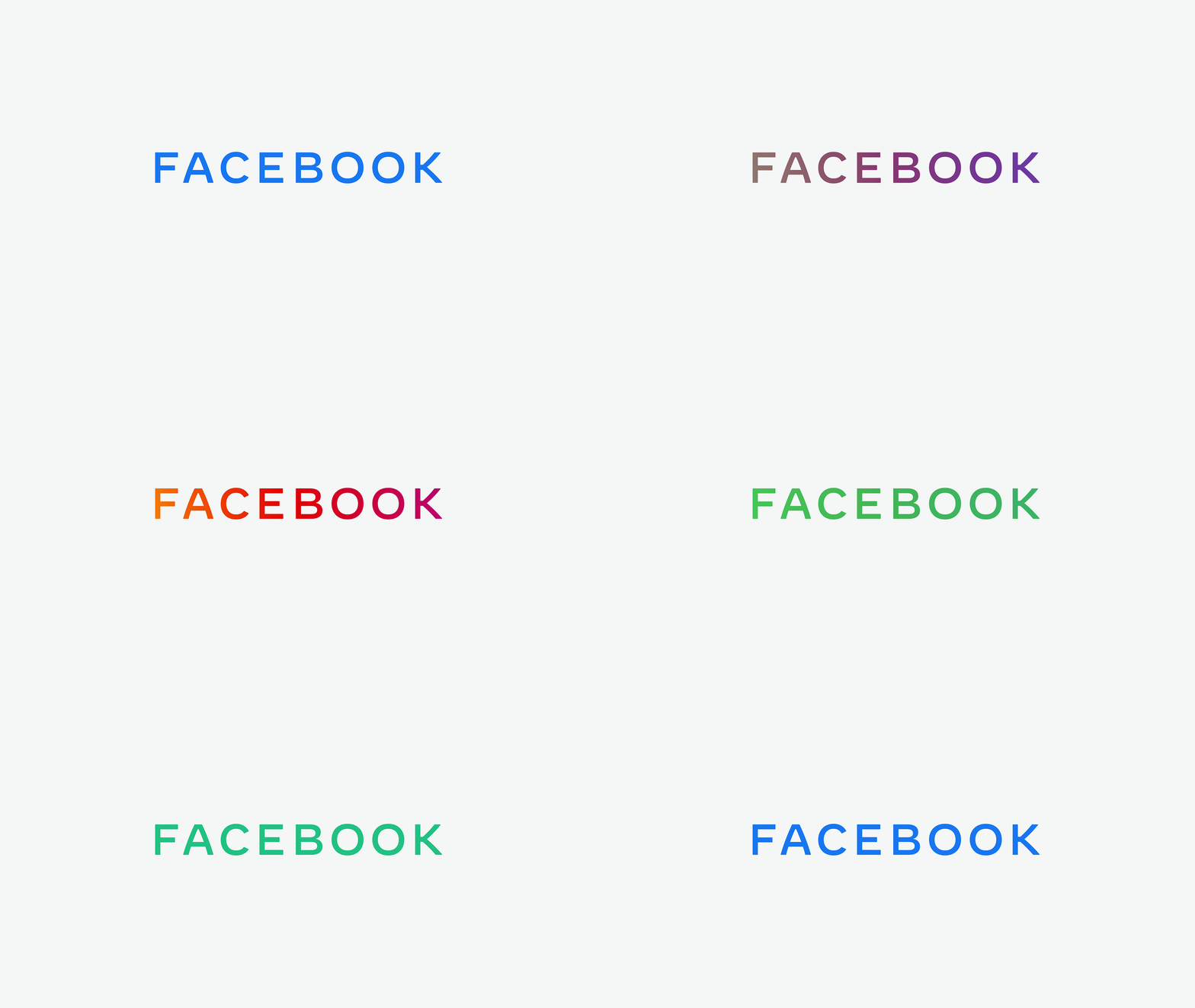
So the question comes back to why people liked the original lowercase logo better than the all caps version. One argument exists that lowercase typography is visually softer than the contrasting sharp edges and straight lines of capitalization. The curves often associated with lowercase letterforms can provide viewers/readers with visual pause and invoke a feeling of comfort. According to two studies published in Springer Science+Business Media—two authors found that psychologically, consumers feel closer to lowercase wordmarks, which increase perceptions of brand friendliness compared with the uppercase wordmarks. (PDF Download Available). While these aren’t the only reasons that the lowercase logo appeals to people, they are factors that have merit.
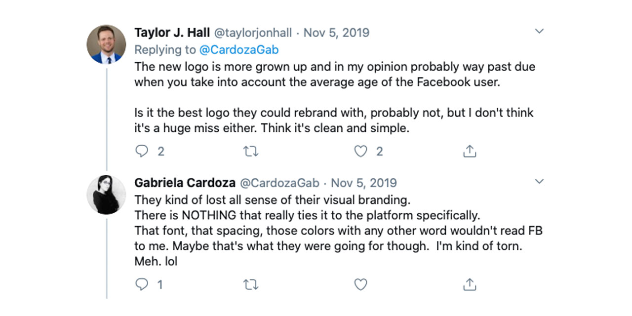
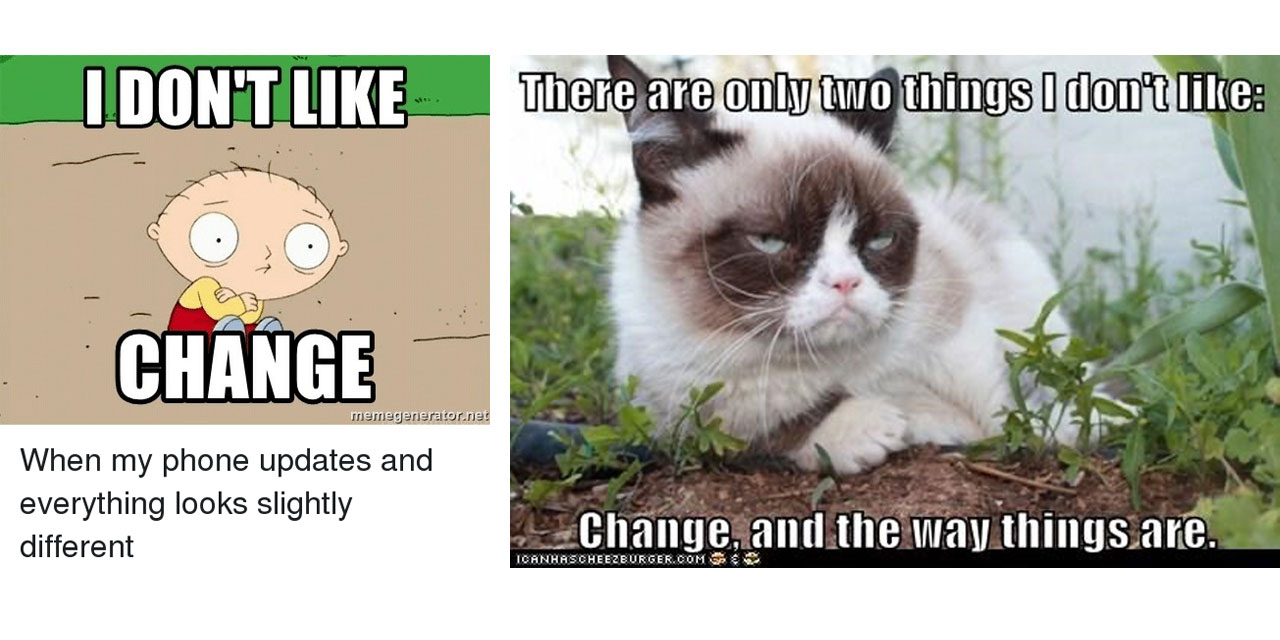
There’s also the simple and undeniable argument that many people just don’t like change. If you ask most people, adapting to change gets exponentially harder with age. Facebook’s lowercase logo has equity with users that have been using the platform for over a decade, and that value cannot be quickly replaced. Luckily for us, we don’t have to choose. Facebook doesn’t appear to be changing the public facing “app version” of the logo any time soon. That means we’re all safe to sit comfortably in the platform’s lowercase sameness and take selfies with the newest face filters of the moment.
