Top 5 Coolest Team Logos in Major League Baseball
After the NBA and NHL seasons come to an end in June, the spotlight belongs to baseball. It’s the game of summer— associated with sunshine and cold beer; green grass and hot July nights under the lights.
With batters staring down pitchers and outfielders staring up at bright skies to catch pop-up flies, this sport played in this season is the whole reason we have baseball hats. Of course, today’s baseball caps aren’t just for utility. They’re a branding tool. One of the many items adorned with the team logo.
While logos are always an important aspect of brands—giving people a quick visual identifier that cues the brain to think of the organization—they hold even greater weight in the world of sports. The reason: merchandising. For teams, a cool logo can be the difference between a $25 t-shirt sale and a hard pass.
Which brings us back to baseball. Major League Baseball (MLB) currently has 30 teams, some of which have been around for over a century. Their logos have changed and evolved, with at least few teams making some sort logo tweak almost every season. So which MLB teams deserve the pennant for their current logo incarnations? Check out the Speaking Human top five below to find out…
Power Rankings: Five Most Effective MLB Team Logos
Here are our picks for best MLB team logos. While different variations of MLB team logos exist, we based this ranking off logos displayed on the Team-by-Team Information page of MLB.com.
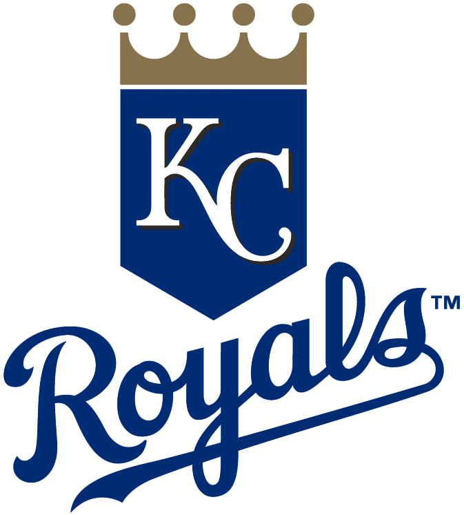
5. Kansas City Royals
There is not a team name you want to punch in the face more than “Royals”. And yet this logo somehow takes that snooty name and makes it accessible to the people. The mix of the crowned, KC-adorned home plate with the angled, traditional baseball script of “Royals” works to undercut the classist, elitist connotations of the name and deliver a visual representation that has style and cool.
4. Chicago White Sox
Originally, this logo sat just outside our top five. But it kept glaring at us angrily. And then we’re pretty sure it threatened to slit our throats. And then we got scared… In general socks (or sox) are not particularly badass. And yet this logo is surprisingly badass. Consider us intimidated.

3. Detroit Tigers
We don’t generally love the single-letter logos (see teams like Pittsburgh and Washington). Mostly because they’re just pretty boring. But Detroit’s is different. The Old English “D” with its many curved lines and sharp edges is fascinating to look at. It demands attention and thought, and has a strong aura about it. Over time, it’s become not only emblematic of the team, but the city itself.
![]()
2. Los Angeles Angels
As a team name, “Angels” is probably one of the worst. After all, who’s scared of angels? Angels are kind and lovable with fluffy white wings. But this logo definitely makes lemonade from that lemon of a name. Squeezing a halo onto a sharp-edged red “A” that may or may not have devil horns creates an entirely different impression. Like a biker gang called “mothers”, it somehow flips the script.
![]()
1. Chicago Cubs
This logo plays amazingly on the double Cs of the team name. It harnesses the power of the curve and plays on the bear connection with a “C” that seems ready to devour the rest of the name. The choice to use red, white and blue are pure Americana, but it’s the circular flow of this logo and it’s baseball-like appearance that earn it the title.
![]()
Honorable Mentions
These logos just missed the cut…
Houston Astros
Orange and blue and baseball go well together (we like the Mets logo for this reason too). The lone star in the backdrop also works.
![]()
New York Yankees
The bat with a top hat is both stupid and endearing.
![]()
Oakland Athletics
The colors really stand out here since most teams (oddly) don’t use green.
![]()
Los Angeles Dodgers
This one gets credit for looking different. While it’s possible to read this is as baseball raining (or even peeing?) on the Dodgers, we see it as the Dodgers rising up with a ball hit hard into the heavens.
![]()