Things to Keep in Mind When Creating a Logo for Your Brand
The following is a guest post from Brian Jens at DesignContest. If you’re looking to design or redesign your logo, there’s some good info here to keep in mind…
The main idea of a logo is to capture the essence of your business and represent your company’s image.
Just like people, logos have their own signature characteristics. They can look reliable, energetic, friendly, etc. If you want to look serious, than the logo itself should be businesslike. If your company is all about fun or innovation, that should be reflected in your logo.
Remember: Every detail matters. If you want your logo to represent a certain image, you have to know the exact impression you want to make and choose the most appropriate colors, fonts and concepts for this.
What a good logo does…
- It helps you stand out—your company will be recognized among others
- It helps to create a visual image of your company
- It defines the uniqueness of your company
- It attracts clients—there are a lot of design cases proving that a successful logo (or a change of logo) can help to gain more trust and approval from customers
Design
We all react to bright colors and unusual shapes. They catch our attention immediately (even if we realize a moment later that the logo itself is bad). Original and colorful design is a good way to attract customers’ attention—but only if it also is thematically relevant and related to your business. Otherwise, it won’t build a strong connection.
When you are designing a logo, you also have to remember that it can be used in different sizes and with various colors (for example, if it is printed on T-shirts). In this case, it would be wise to avoid shapes and colors that are too extraordinary. All those awesome and unusual details can look degraded when they are resized or if they don’t combine well with other colors.
Example: Nike’s simple logo is one that works well in a wide variety of sizes and colors schemes

History
A logo also should represent your company’s history (if it has one) or at least relate to it. If a company is present on the market for a long time, its new logo should remind people of the old one. Otherwise the target audience may not react well (always remember that people are quite conservative by nature).
If you are designing a logo for a brand that is new on the market but plans to stick around for a while, be cautious jumping on current trends. It’s possible that those trends will look odd and old in only a few years. It’s better to stick to classic design concepts. After all, they’re “classic” for a reason—they stand the test of time.
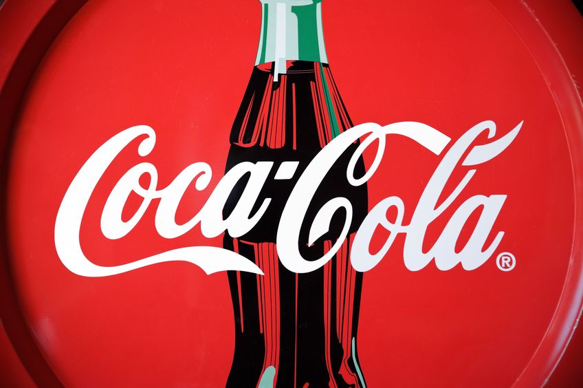
Example: While Coca-Cola’s logo has changed a lot over the years, it always connects to the company’s history in a familiar way
Types Of Logos
There are four types of logos:
- abstract (or symbolic)
- illustrated
- textual
- mixed
Abstract or symbolic logos are good for international companies (because various well-known and easily recognizable symbols can be interpreted differently in different countries and cultures).
Textual logos are good for multifaceted businesses that want to be known by their name (think Google).
Illustrated logos are simple drawings that represent a company’s image (for example, a plane or a bird logo for an aviation company).
Mixed logos combine both text and illustrations (and sometimes can be symbolic too).
It’s important to know the different types of logos so you can choose the right one for your specific company or brand.
About the Author: Brian Jens is a designer and a blogger, currently working for DesignContest. He enjoys monitoring the latest trends, learning new design tips, and doing good and thorough research. If you have some ideas that you want to share with the world, feel free to contact Brian—he’ll gladly do the necessary research for you.


