6 Creative Variations of the Iconic Disney Logo
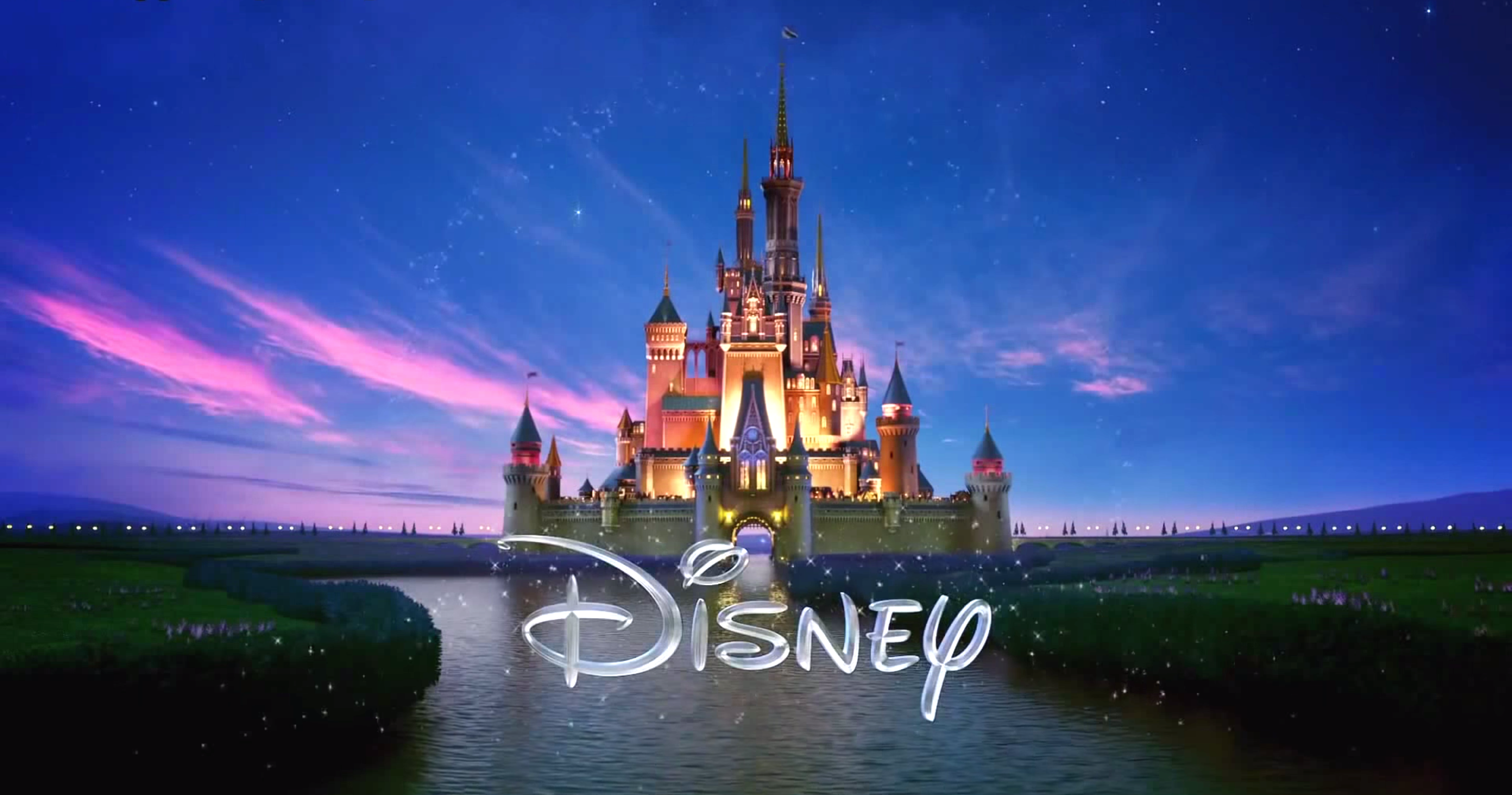
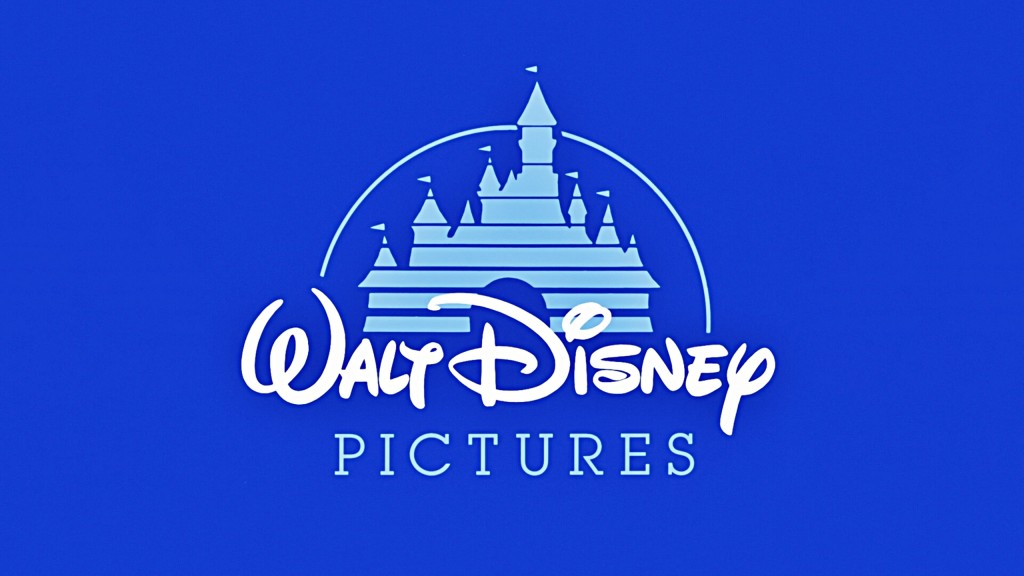
What was the first movie to display Disney’s iconic “Magic Castle” castle logo?
The largely forgotten animated film “The Black Cauldron” in 1985.
What was the first movie to display a customized version of the Walt Disney Pictures logo?
The groundbreaking computer-animated film “Toy Story” in 1995.
Now you’re all set if those questions come up when you appear on Jeopardy. But if they start asking about specific variations on the Disney film logo, that could get tricky. There are dozens of them.
Disney does a pretty cool thing where it customizes the logo before many of its movies. So when you see “Tomorrowland” it will have a slightly different logo than say “Maleficent” or “Chicken Little” (though they all have the same recognizable magic castle core).
3 Advantages of Disney’s Logo Customization
Disney’s strategic logo customization provides these key marketing and branding benefits:
1. It connects the larger brand to the smaller effort
This is something that too often gets overlooked in marketing: How does the individual marketing piece fit in to the greater whole? Disney’s logo customization connects the brand and its history with the specific movie, announcing “this is one of ours” in a way that’s noticeable and impactful.
2. It makes the logo stand out
You see the same thing a thousand times and it essentially disappears to you. It becomes white noise. By changing it up, you make it stand out—stirring brand awareness and recognition.
3. It sets the tone for what’s to come
The logo variation indicates what kind of movie you’re going to get: funny, animated, cool, scary. Establishing tone is one of the most underrated aspects of effective marketing and branding.
6 Creative Iterations of the Disney Logo
Here are some of our favorite customized versions of the Disney logo:
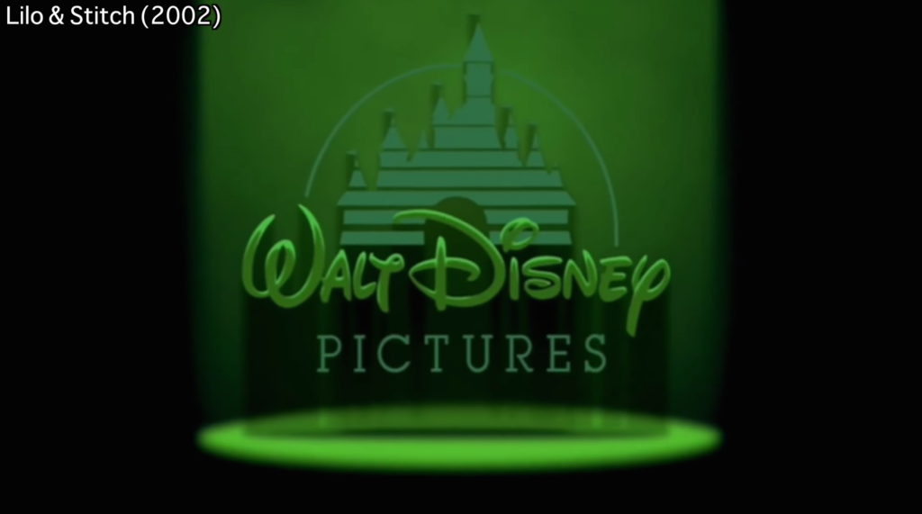
1. Lilo & Stitch
The logo gets alienated with a green honing beacon and a UFO castle abduction.
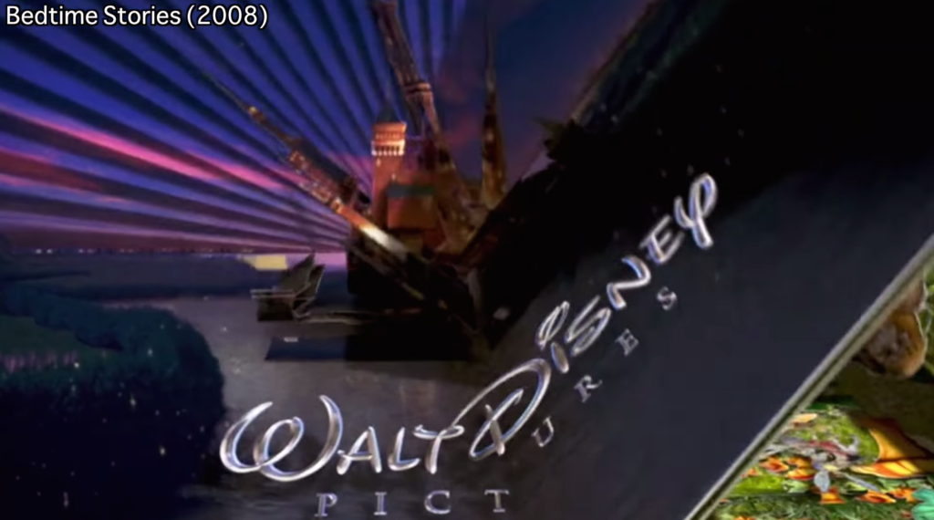
2. Bedtime Stories
Another one of our favorites, with the magic castle turning into the page of a pop-up book.
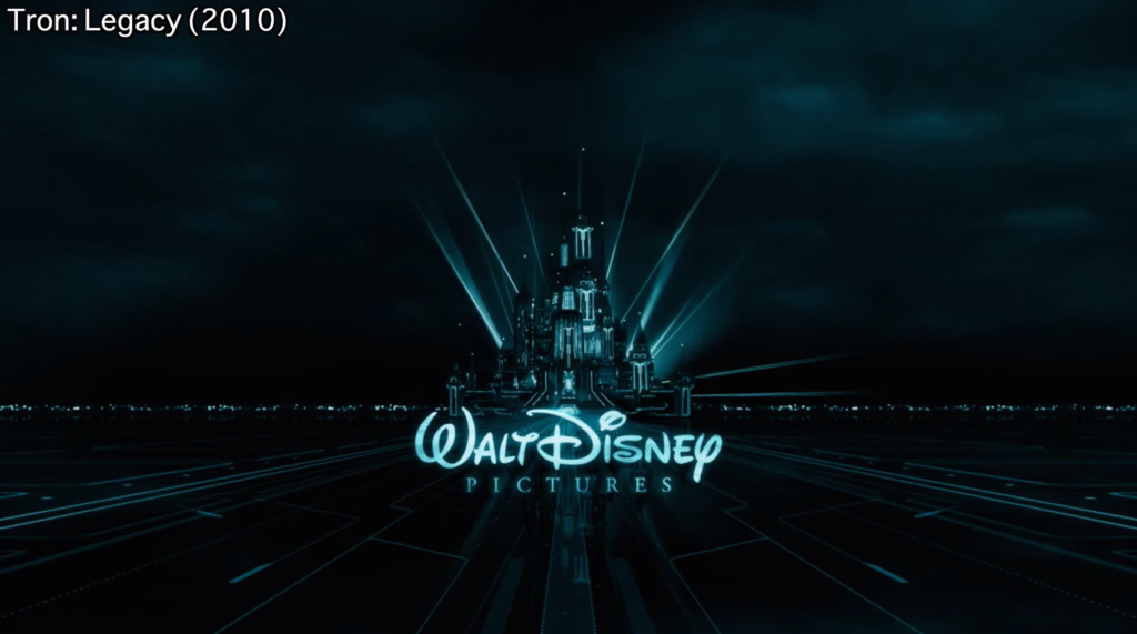
3. Tron Legacy
This might be our top pick. A total “Tron”-ization of the magic castle.
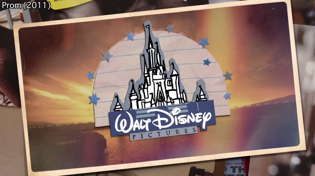
4. Prom
The Disney logo gets the teen scrapbook treatment.
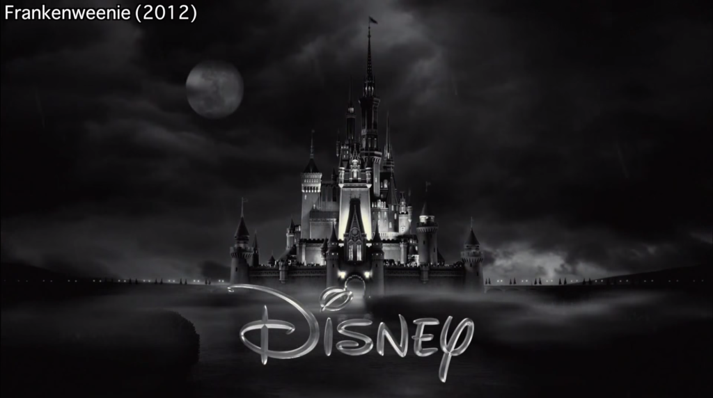
5. Frankenweenie
The magic castle goes black and white and transforms into Dr. Frankenstein’s castle.
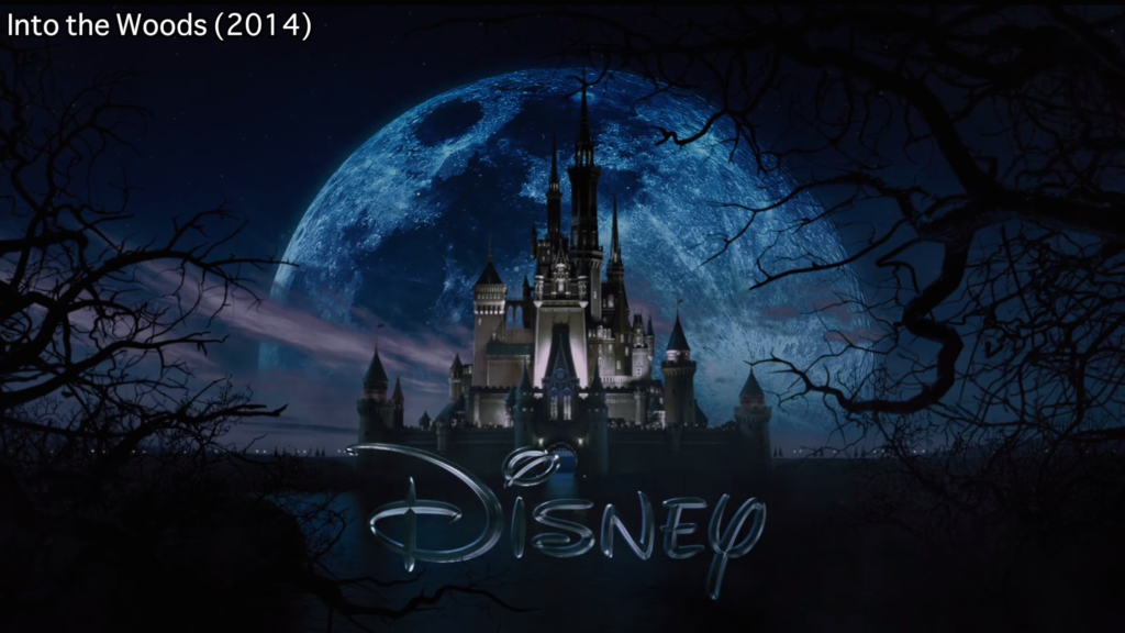
6. Into the Woods
A little bit of creepiness gets added to the logo via a scary moon and twisted tree branches.
