An Example of Exceptional Product Packaging from a Yeti
To improve the audio quality of our acclaimed (by us) marketing podcast Speaking Human, MONSTERS invested in new high-quality microphones awhile back. Recently, we found the old product boxes and went to throw them away when something stopped our furry feet in their tracks: The packaging.
The product packaging for the Yeti microphone is such a finely crafted piece of design work we honestly didn’t want to part with it. Now that’s effective packaging! So enthralled were we by the gloriousness of the packaging, we decided to share it with you here today.
Here are some pictures of the Yeti packaging…

As it should, the front shows the product:

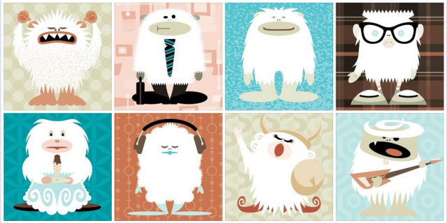
One side focuses on branding, with the definition of a Yeti (traditional and the product) and some fun, simple, colorful images:

The other side focuses on how the product works, describing the different settings and what they can be used for (instruments, podcasts, conference calls, etc.):

The back of the box outlines the key features of the microphone and what’s included with it:

Even the top of the box includes a image—showing the product and how it’s used, with a little nugget of branding on the computer screen:

It’s a very engaging package, representing the product and brand effectively:

3 Things the Yeti Packaging Does Exceptionally Well
1. It Draws the Eye – In a sea of packaging, this one stood out to us. Based on the packaging, the perception is that this is a quality product (which it is).
2. It Explains the Product – The packaging provides useful information about the product in a visually engaging way that makes you want to actually read it.
3. It Creates a Strong Sense of the Brand – This is not just a microphone, it’s a Yeti. And you get a sense of that from the vivid graphics and fun tone.
When it comes to product packaging, you can learn a lot from a Yeti.


