Pulp Friction: Comparing the Websites of Leading Orange Juice Brands
Pop quiz: What was the last brand of orange juice you bought? If you’re a die-hard orange juice drinker you may be able answer that question. For the rest of us, it’s a little tougher. Orange juice is just one of those products that isn’t super brand definitive. It’s not like Coke and Pepsi… it’s just orange juice.
That’s not to say there aren’t well-known, leading brands in the category. According to Statista, the leaderboard for refrigerated orange juice sales in the United States in 2016 looked like this:
Tropicana – $930.64 million
Simply Orange – $746.21 million
Private Label (Various) – $512.62 million
Florida’s Natural – $303.34 million
Private label products are those produced by one company for another. So, for example, the orange juice with your grocery store’s brand name on it. For the purpose of what we’re doing here today, we’re going to set private label brands aside. What we’re left with are three major orange juice brands—Tropicana, Simply Orange, and Florida’s Natural.
What’s Missing in Orange Juice Marketing & Branding
What’s interesting (or, more accurately, uninteresting) about orange juice is how little differentiation there is in the market. Think about packaging alone. Almost all orange juice has similar packaging. It either comes in a white carton or a clear bottle with a colored cap. The label colors are the same—orange, green, and white. These make sense given the product, but branding-wise they’re pretty boring.
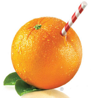
 A great example (maybe the only great example) of standout orange juice creative is Tropicana’s orange with a straw in it (which the company disastrously tried to move away from in 2008). This is probably the most memorable brand image in this product category. There’s just not a lot of competitive differentiation going on with orange juice. Which is in big part why most people just think of orange juice as orange juice, without a strong brand association.
But what about the web? Does the generic orange juice marketing/branding approach apply on the web as well? For many brands the internet is a creative sandbox where personality can shine through. Is that the case for orange juice brands? We set out to find the answer…
Grading the Websites of Leading Orange Juice Brands
We graded the websites of the three top orange juice brands noted above using the following criteria:
Design – Did it look good?
Content – Did it sound good?
Message – Were the takeaways clear?
Navigation – Was it easy to get around?
Social (Bonus) – How active is the brand on social media?
Here’s how each of the brands stacked up…

Tropicana
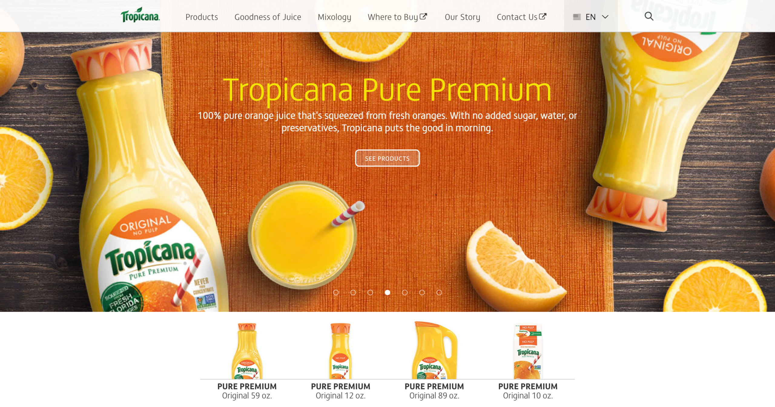
Of the three orange juice brands, Tropicana has the most polished website. It’s what you would expect from the leader in the category (which probably means they have the most marketing spend). The design is clean with bright, colorful images over a simple white background. Exactly the feeling you would want from a fruit juice.
The healthiness of their products is promoted throughout the site, and the content is clear and straightforward. We particularly like their “Goodness of Juice” section (though we’re not crazy about the name). They’re the only brand here with what is essentially a benefits section on their site.
In terms of social presence, Tropicana has Pinterest, Facebook, Twitter, YouTube, and Instagram pages linked from their site. While all the pages are done with polish, none of them are updated more than a few times a month.
Grade: B+

Simply Orange
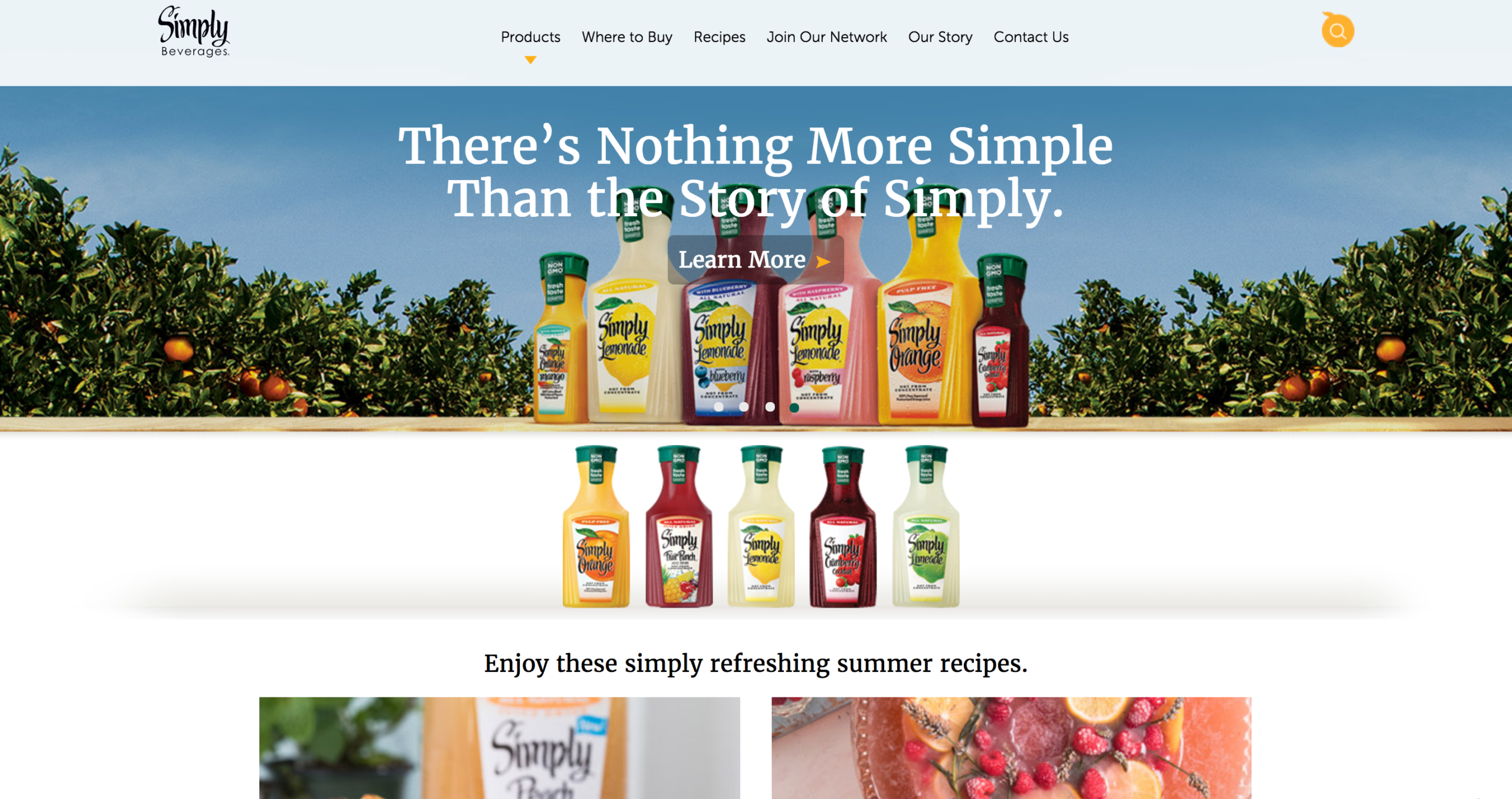
The Simply Orange website is essentially a pared-down version of the Tropicana site—though the design of the Tropicana site is a little more pleasing to the eye (with that site being just slightly brighter). Paralleling the brand message, the Simply Orange website is fairly simple in its execution.
They mention the words “simple” or “simply” in every slider on the home page, with the message being they make simple (healthier) beverages. The content is concise and sparse, maybe even a little too light on pages like “Our Story”—which left us wanting just a little more. This site could also use a greater focus on consumer benefits and what makes Simply better than the rest.
The site does do a great job promoting its recipes. There are a lot of them, and they appear on both the home page and a specific “Recipes” page. They are also integrated into the brand’s social pages. The Simply Orange website has links to Facebook and YouTube pages—with the Facebook page updated about once a week.
Grade: B-

Florida’s Natural
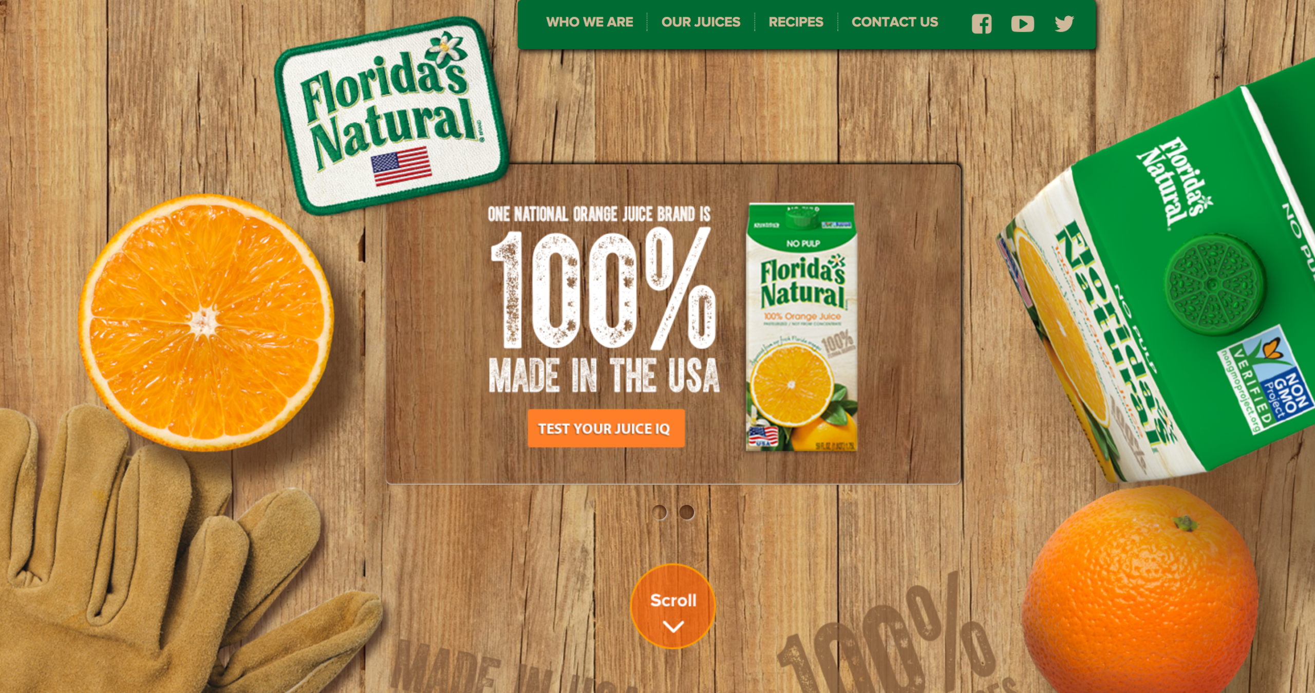
Give Florida’s Natural credit for having the site that looks the most different. While website backgrounds can be a distraction, making a site feel cluttered, this one works alright—with the wood exuding a natural, orange crate feel. The navigation is simple and straightforward, with four sections. Can’t say we love the tab setup on the individual pages, but they are easy enough to use.
Of the brands, Florida’s Natural probably has the best story—and we really like how the history is presented with a visual timeline. Still there’s probably more that could be done to promote this aspect of the brand. The “Our Juices” section has some good messaging and brand differentiation, but this messaging is also almost a little too hidden within the site.
In terms of social, the Florida’s Natural website links out to Facebook, YouTube and Twitter profiles. While YouTube seems fairly stagnant, the Facebook and Twitter feeds are updated semi-regularly (probably more than the other brands).
Grade: B
Final Thoughts: A Close Call with Abundant Opportunities for Brand Separation
In terms of overall website appeal, the Tropicana site has the slight edge. Pound for pound, it’s just the most solid site. Florida’s Natural has some great content and messaging on its site, it just needs to be presented a little more effectively to better resonate with visitors. We also like what Simply Orange is doing with their recipes as a content marketing tool. They’re definitely leading in that area.
Ultimately, we didn’t find the brand differentiation on the web we were hoping for among the leading orange juice brands. As with other areas of marketing and branding, there’s just an overriding sense of sameness that kept any one brand from really popping out. The good news: The opportunity is definitely there if one of these brands wants to step up and separate itself from the pack.


