Anatomy of a Brand Email: Netflix Price Change
On February 1, 2018, Netflix sent out an email to many of its subscribers (myself included) reminding them of an upcoming price increase. This was not breaking news—the company first announced the increase back in October 2017. This was more of a “your bill is going to look different next month, here’s why” communication piece.
From a PR and customer service perspective, the idea was probably to try to get out ahead of the price hike a little. By addressing some of the resulting confusion and anger ahead of time, you don’t have a flurry of customers hitting the company all at once. Another reason for the email is to, in some ways, try to justify the price hike to customers and maybe even extinguish some of those hotheads altogether.
So did the Netflix email successfully accomplish these things? And, if so, how? Let’s cut it open and take a look at what’s inside…
9 Moves Netflix Made With Its Monthly Price Increase Email
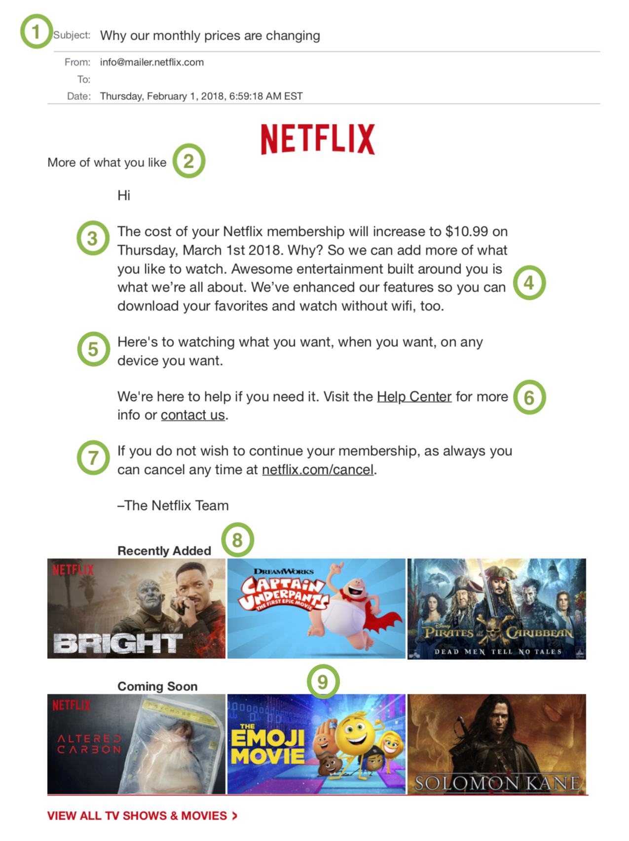
Here’s a look at the email Netflix sent out to customers, with different parts of its anatomy labeled by number. Below that, you’ll find a breakdown of what each part does—and how well it does it:
Figure 1: The Netflix February 1 price hike email
1. Subject Line
The first word and the key word here is “Why”. It’s a promise. They’re going to tell you where your extra scratch is going. They’re putting the answer right in your inbox. For me personally, that “why” was draw enough to open. I wanted to know why.
2. Summary Header
The first line of the email body (after the Netflix logo) is an answer to the question posed in the subject line. It’s a header that reads “More of what you like”. It essentially summarizes the premise of this email—they are raising their prices so they can keep taking Netflix to the next level for you. The brilliant move here is putting it on “you” (or me). They’re saying you wanted this; this is all for you.
3. Just the Facts
They don’t linger too long on the details they know are painful for the customer—just one sentence telling you in a very succinct way what you don’t want to hear. This is what the new cost of membership will be. This is when it will happen. No extra adjectives here or more words than necessary.
4. Now the Fun
The next three sentences (technically four if you count the “Why?”) are about what you get for your extra money. And that’s “awesome entertainment” that’s “built around you” with “enhanced features” so you can “download your favorites” and “watch without wi-fi”. There’s a lot here. And it’s all focused on “you”! It’s a nicely structured paragraph. Netflix gives you one short sentence of bad news, then throws you a three-sentence party.
5. Tagline Time
To me, this line/paragraph is the one misstep of the email. It just feels too much like a tagline, instead of a communication or conversation. I think it might have worked better to move this paragraph to the end of the email right before the sign off.
6. Get Help
Some easy, convenient help links for people who have questions or maybe just want to rant or rave. Putting them in the body of the email makes them easier to find or see than just sticking them in the footer (which is the standard).
7. Get Lost?
Now this is a bold move. You don’t often see a company putting a cancellation link in the body of an email. You might see a link to the help team if you have a cancellation-worthy problem, but not a direct click to cancel. This might be a stretch, but I almost feel like this is a move of cockiness on the part of Netflix—which hit a record 117.6 million subscribers worldwide in Q4 2017. Could it be they feel so confident in their product that they’re daring customers to say it’s not worth a dollar or two more? Just a thought.
8. Picture the Product
They end the email with a small glimpse of what it is they give you. It’s a good move, and one that adds some much-needed design and color to the email. On the flip side, this is also a little risky. Show people things they don’t like and they may start to wonder about the value of their Netflix investment…
9. Dear God, Why?
Seeing this image of The Emoji Movie made every muscle in my body want to click the cancel button. Why, Netflix? Why?!?

AUTHOR: Shad Connelly
ORIGIN: Communications Director @ MONSTERS Unlimited
Follow Shad on Speaking Human / Human Content from Shad

