5 Examples of Awesome Poster Design from John Wick
It’s shocking that Keanu Reeves is actually getting older. The star of movies like Bill & Ted’s Excellent Adventure, Point Break and The Matrix has been bringing his awesome hair and exuberant “whoa!” to movie screens for four decades. If this dude never aged a day, I wouldn’t be the least bit surprised. Keanu is eternal youth cloaked in human flesh.
But alas, time waits for no one—not even the star of The Devil’s Advocate. And so Keanu Reeves has inexplicably grown older. While that is a strange spectacle to behold, his second act in movies has at least been pretty damn interesting. In recent years, Keanu has moved from middle-of-the-road, big-budget movies to smaller, more daring films.
He directed and starred in the solid Man of Tai Chi in 2013, had a small part in the very weird Neon Demon last year, and even provided the voice of a cat in the aptly titled Keanu. Perhaps most notably, he had a breakout hit in 2014 with the modestly budgeted action romp John Wick.
John Wick is what you would call a surprisingly good genre flick. It’s the kind of movie you start watching with no expectations and find yourself enjoying and watching again. The plot is pretty simple. The action is cool and kinetic. The body count is high. Basically, it’s a perfect Keanu Reeves movie.
And a successful one—banking $86 million worldwide on a $20 million budget. Of course, where there’s success, there’s a sequel. That’s why Reeves is back with John Wick: Chapter 2. Thanks to the strong following the first film developed, this one is sure to be an even bigger hit.
But Enough About the Man, Let’s Talk About the Marketing
The various poster designs floating around the internet for John Wick: Chapter 2 are almost all gangbusters great. They play up the crime genre angle and use space and color (or lack thereof) in effective ways. Most importantly, they have a strong sense of style and “cool”—which is exactly what the target audience for this movie is looking for in their viewing experience.
Here are five of the coolest John Wick 2 posters…
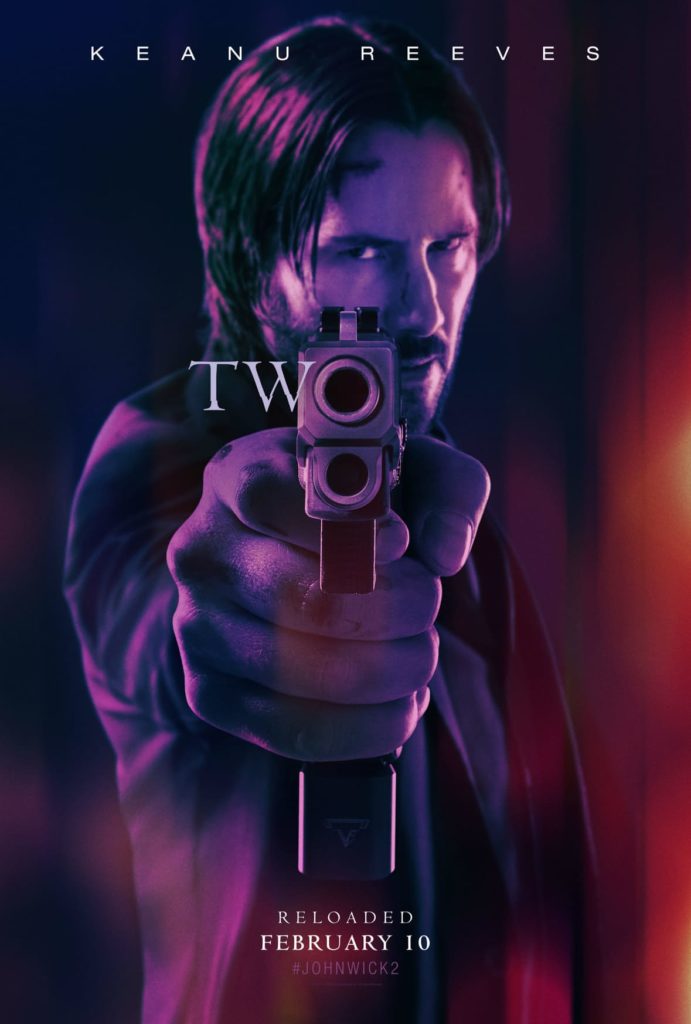
5. Purple Reloaded
The purple hue. The Keanu stare. The barrel as the “o” in “two”. The tagline “reloaded”. This gives fans exactly what they want from top to bottom.
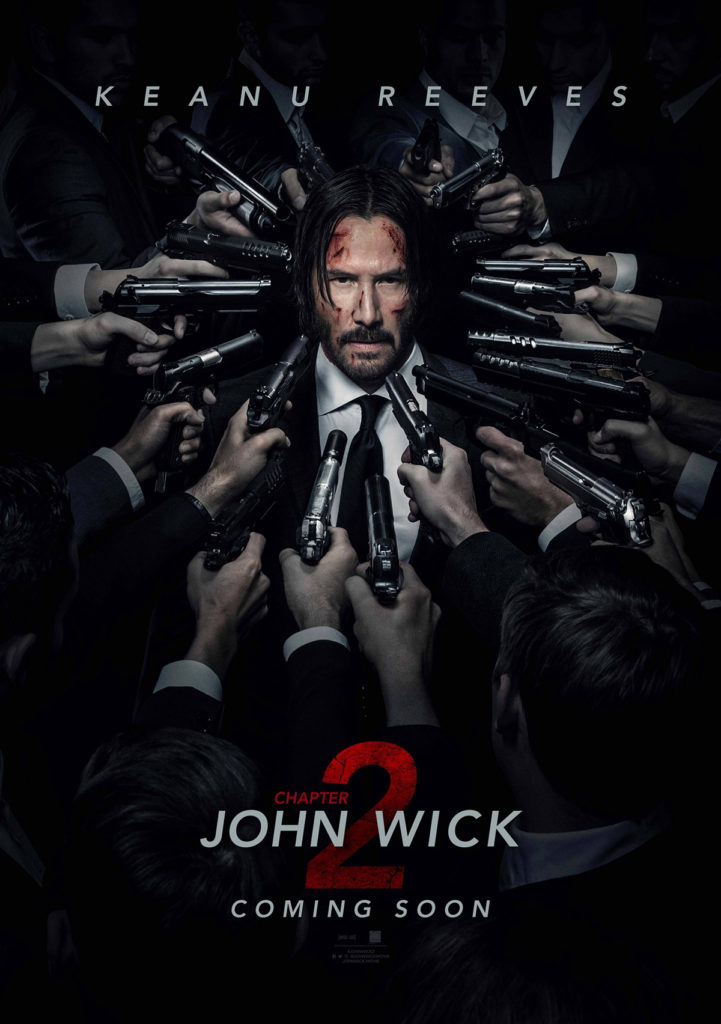
4. Circle of Guns
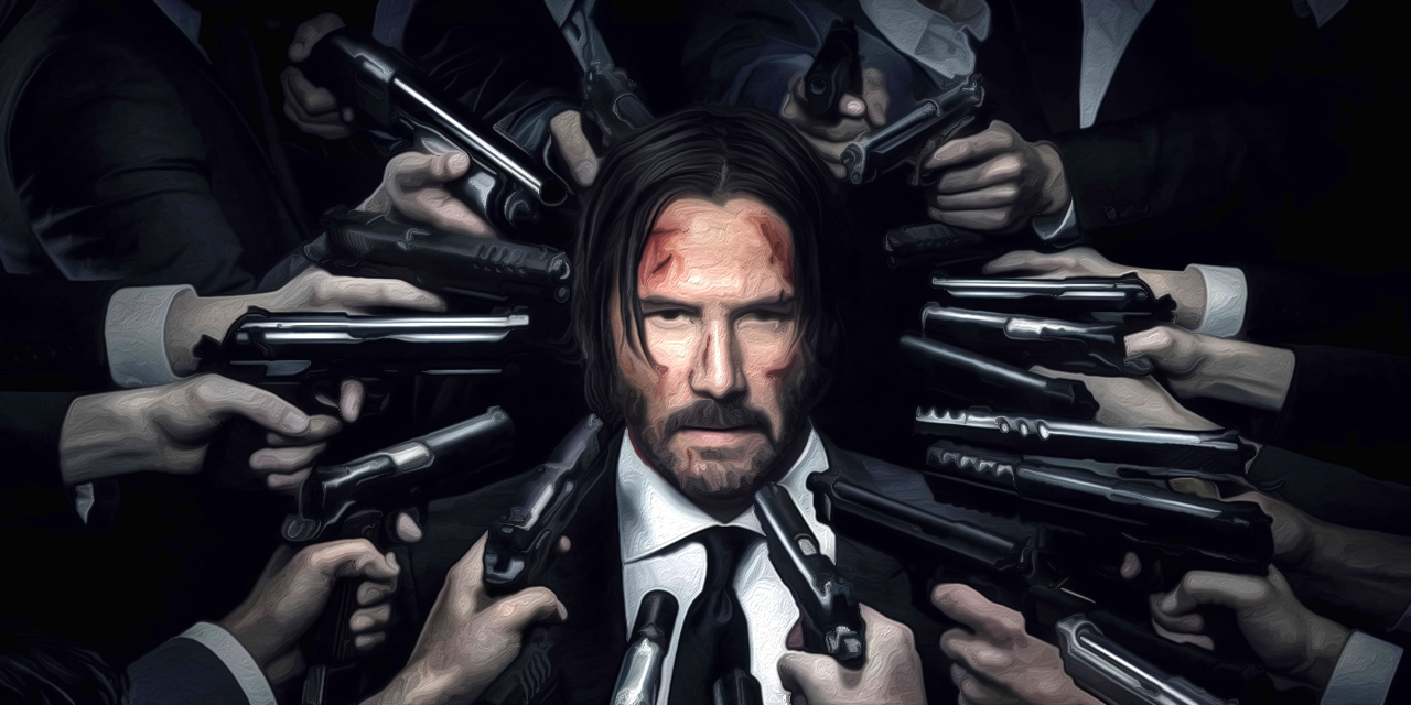
If you like movies where one man takes on many men with guns, John Wick 2 is for you.
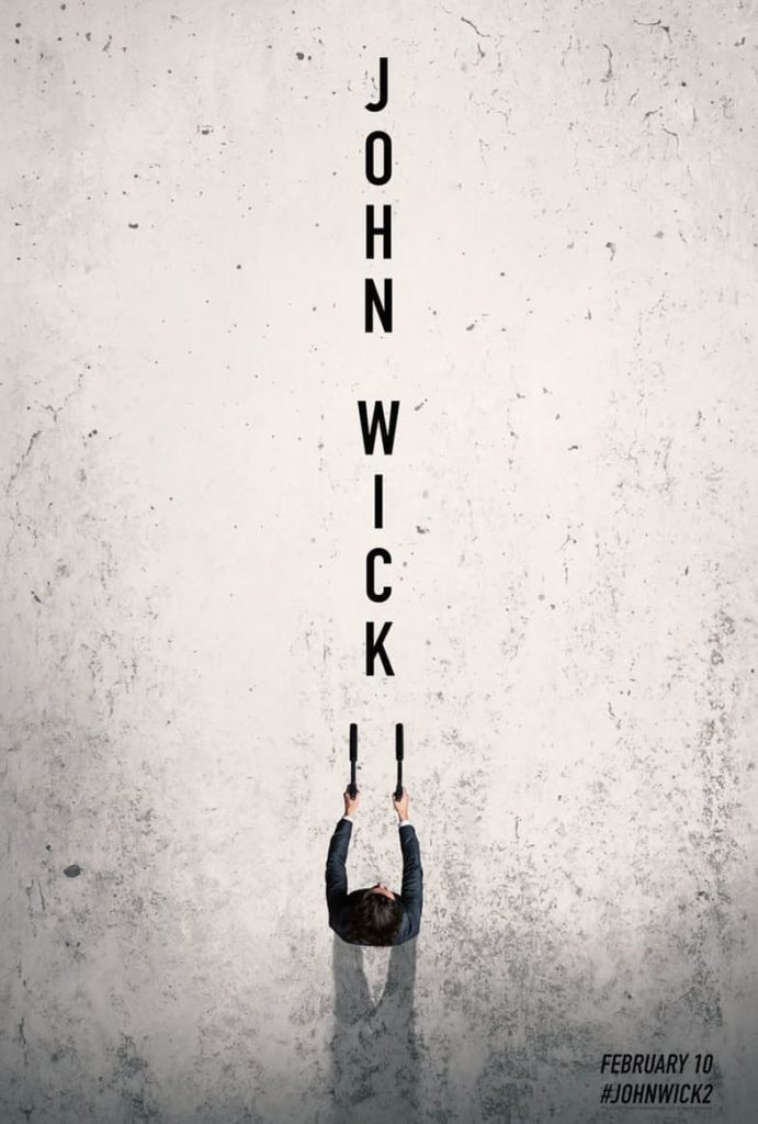
3. Two Guns
You follow the letters. Then you see the “II”. Wait those are guns with giant silencers! This one works the eyeballs beautifully.
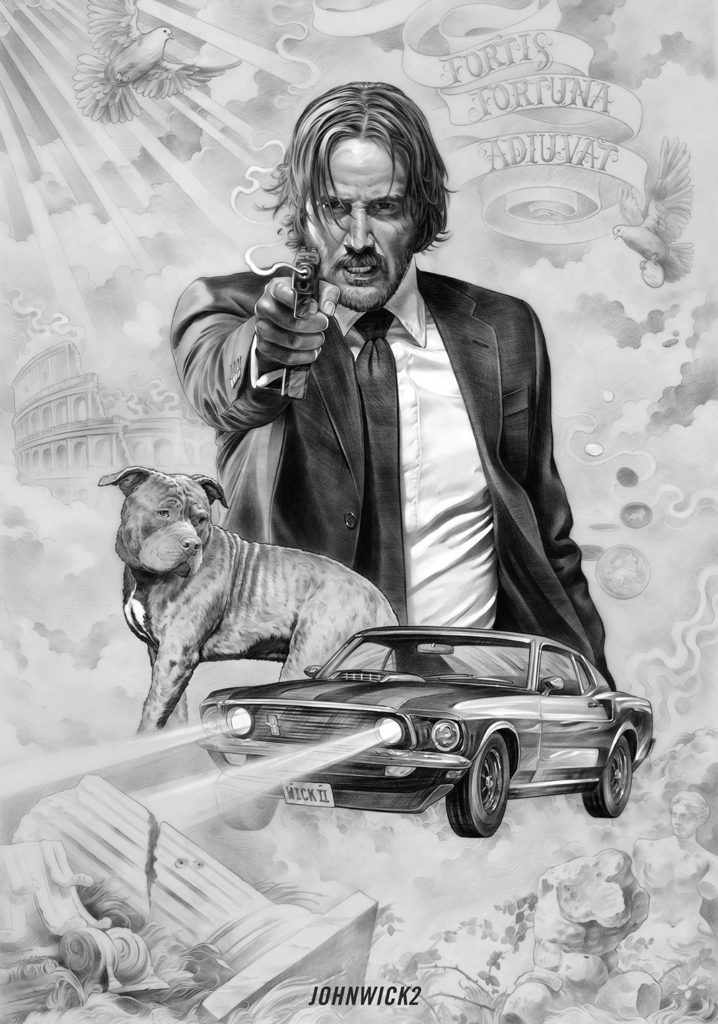
2. Tattoo Art
This is actually a piece of fan art designed by a tattooist that was posted on The Nerdist site. It’s got John’s dog, his car, and there’s even a dove. It’s awesome.
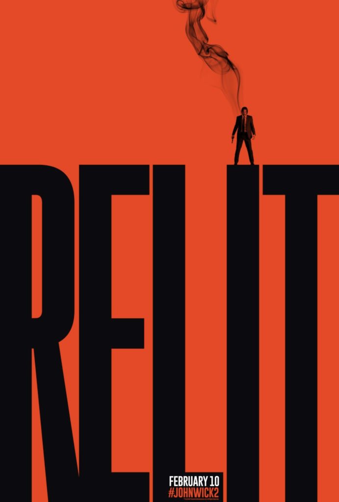
1. Wick Relit
The best of the best. The red and black design. The giant “RELIT” (which definitely should’ve been in the title of the movie). The image of John atop the “I” smoking like a gun. This is the kind of poster you frame and put on the wall.

AUTHOR: Shad Connelly
ORIGIN: Communications Director @ MONSTERS Unlimited
Follow Shad on Speaking Human / Human Content from Shad

